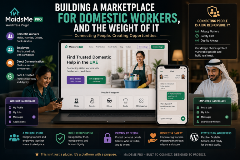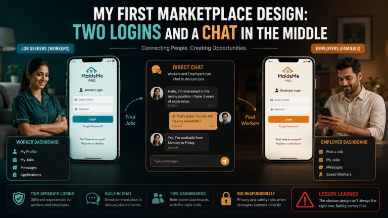
A family hiring someone to work inside their home judges the platform in the first three seconds, before reading a word. If MaidsMe looked like a classifieds dump, no privacy architecture underneath would matter, they would already be gone. So the front end was built to a deliberate standard, a premium look, glassmorphism surfaces, smooth motion, and this post is both the how and the honest why.
Glassmorphism is the frosted-glass card look, translucent surfaces that blur whatever sits behind them, and it rests on one CSS property doing the heavy lifting:
.mm-card {
    background: rgba(255, 255, 255, 0.12);
    backdrop-filter: blur(14px);
    -webkit-backdrop-filter: blur(14px);   /* Safari */
    border: 1px solid rgba(255, 255, 255, 0.25);
    border-radius: 16px;
    box-shadow: 0 8px 32px rgba(0, 0, 0, 0.12);
}
Each line has a job. The rgba background is mostly transparent white, the tint of glass. backdrop-filter blur is the frost, blurring the page behind the card, and the webkit prefix is not optional, Safari still wants it. The faint border catches light like a glass edge, and the soft, large shadow lifts the card off the page. Together they read as depth and expense, which is the point, the style signals care.
Motion got the same restraint. Transitions on hover, nothing bouncing, and everything respecting the browser’s fast path:
.mm-card { transition: transform .25s ease, box-shadow .25s ease; }
.mm-card:hover { transform: translateY(-4px); }
Animating transform instead of top or margin matters technically, transform runs on the compositor, smooth even on a cheap phone, while animating layout properties makes browsers recalculate the page per frame and stutters exactly on the devices many of this platform’s users hold. And two honesty notes on the style itself. backdrop-filter is expensive, a page tiled with blurred cards scrolls badly on low-end hardware, so glass is rationed here, profile cards and the header, never whole backgrounds. And frosted translucency eats text contrast, so every glass surface carries text sized and weighted to stay readable against a busy backdrop, checked, not assumed, because a trust signal that makes content harder to read has defeated itself.
Does looks-as-trust actually hold? Watch anyone choose between two unknown services, the polished one gets the click, and research on credibility judgements says the first assessment is visual and near-instant. Design is not decoration on a trust platform. It is the first claim the platform makes about itself.
A few things people ask me about this
Why does backdrop-filter not work in my browser? Usually Safari without the -webkit- prefix, or an older browser entirely. Ship both properties and a solid fallback background so cards degrade to plain panels, not invisibility.
Why animate transform instead of top or margin? Transform animates on the compositor without recalculating layout, so it stays smooth under load. Layout properties force per-frame reflow, which is exactly what stutters on budget phones.
Next
That completes the platform, the flows, the guards, the surface. The final post is the honest accounting, what MaidsMe taught me about judgment over code.